
Fleet Analytics & Charts
See Everything. Know Everything. Act Immediately.
Your fleet generates thousands of data points daily fuel fills, speed events, idle minutes, maintenance costs, delivery times, temperature readings. But scattered data buried in spreadsheets is noise, not intelligence. Without live visual dashboards, the insights that could save money, prevent accidents, or improve SLAs stay hidden until the monthly report arrives too late.
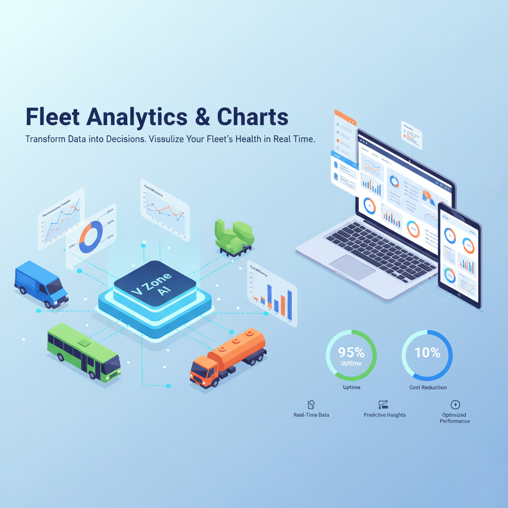
V Zone’s Fleet Analytics & Charts transforms raw fleet data into real-time visual dashboards interactive charts for fuel, driver behaviour, idle trends, expenses, temperature, load, door access, and more. Built-in AI anomaly detection flags outliers automatically, while exportable reports give fleet managers, finance teams, and compliance officers the visual intelligence they need to act fast.
🔍 Why Visual Analytics Matters
Raw data tables don’t change behaviour or drive decisions visual context does. V Zone’s charts replace spreadsheets with dynamic visuals that make fleet performance immediately understandable:
- Spot trends early fuel spikes, idle increases, safety score declines
- Align team performance with fleet-wide benchmarks
- Strengthen accountability with visual evidence for coaching and reviews
- Improve board and stakeholder reporting with professional chart exports
- Reduce time spent building manual reports by 60%+
📈 Key Dashboards & Chart Types
V Zone’s analytics module provides nine pre-built dashboard categories each pulling live data from the corresponding fleet module and rendering it as interactive, filterable charts:
🛣️ Trip Performance Charts
- Visualize distance covered, trip count, idle time, and stop duration.
- Compare between vehicles or time periods.
- Identify high-performing routes and problematic patterns.
⛽ Fuel Consumption & Theft Analytics
- Graph fuel usage trends over days/weeks/months.
- Spot under-refueling, sudden drops, or theft indicators.
- Compare fuel efficiency by driver or route.
🚦 Speed & Harsh Behavior Trends
- Charts for overspeed, harsh braking, sharp cornering, and acceleration.
- Filter by driver, trip, or fleet type.
- Score drivers and coach them accordingly.
🕒 Excess Idle Time Trends
- Identify vehicles with the most idle hours.
- Calculate cost of unproductive engine time.
- Set benchmarks for corrective action.
🌡️ Temperature & Cold Chain Analytics
- Real-time and historical temperature charts.
- Alerts for range violations or fluctuations.
- Ensure compliance for pharma, food & sensitive goods.
🚪 Door Status & Access Reports
- Monitor open/close events with timestamps.
- Spot early/late door access or prolonged openings.
- Get alerts for unauthorized access attempts.
⚖️ Load Sensor Charts
- Track vehicle load vs. capacity across trips.
- Identify overloading or underutilization.
- Time and place-based load analytics.
📋 Service & Maintenance Trends
- Visualize vehicle-wise service history.
- Predict next due dates based on usage.
- Track downtime trends across the fleet.
💸 Expense Charts
- Visual breakdown of vehicle-wise or driver-wise costs.
- View monthly cost per km or per trip.
- Set alerts for exceeding cost thresholds.
🛠️ Smart Features
V Zone’s charts aren’t static images they’re interactive, filterable, exportable, and AI-enhanced for the kind of analysis that replaces spreadsheet guesswork:
- ✅ Interactive filters: Segment by date, driver, vehicle group, region, or cost centre
- ✅ Export options: Download as Excel, PDF, or schedule automated email reports
- ✅ Dashboard widgets: Drag-and-drop KPI tiles for a personalised control panel
- ✅ AI anomaly highlights: Outliers and unusual patterns flagged automatically
- ✅ Mobile-friendly: Full chart access on iOS and Android apps
📈 Real-World Impact
V Zone clients use fleet analytics to drive measurable improvements across fuel efficiency, idle reduction, compliance, and decision speed:
- ✅ 40% idle reduction in 2 months from behaviour chart monitoring
- ✅ 2x faster fuel theft detection using sudden-drop graphs + sensor alerts
- ✅ 60% less time spent building manual fleet reports
- ✅ Board-ready KPI exports that replace monthly spreadsheet exercises
Results based on V Zone client deployments. Actual outcomes vary by fleet size and analytics usage. All claims should be verified with V Zone.
👥 Who Uses Fleet Analytics?
V Zone’s analytics module serves four primary user groups each accessing different dashboards and chart types based on their operational role:
- Fleet Managers: Daily operational insights trips, fuel, idle, alerts
- Finance Teams: Monthly cost reports, budget variance, ROI tracking
- Compliance Officers: Audit-ready charts for regulatory proof and SLA documentation
- Operations Heads: Strategic planning utilisation, benchmarking, fleet expansion
🧠 AI-Powered Intelligence
V Zone’s AI engine runs continuously across all chart data detecting anomalies, predicting trends, and highlighting the vehicles and drivers that need attention before problems escalate:
- Auto-generates weekly anomaly charts fuel, behaviour, idle, maintenance
- Highlights top 5 underperforming vehicles by cost, utilisation, or safety
- Predicts next service due dates based on historical usage patterns
- Detects seasonal patterns Ramadan shifts, summer fuel spikes, holiday idle
💪 Why V Zone?
V Zone’s analytics module pulls live data from every platform module GPS, fuel, driver behaviour, maintenance, delivery, expenses, temperature, and compliance into one unified visual layer. No third-party BI tool required:
- 15+ years of fleet intelligence across the UAE and GCC
- Pre-built dashboards for 9 fleet KPI categories ready on day one
- Fully customisable widgets, filters, and scheduled reports
- AI anomaly detection and predictive trend analysis built in
- Works on web dashboard, mobile app, and via API for BI integration
🚀 Ready to See Your Fleet Clearly?
Fleet Analytics & Charts lets you stop guessing and start leading with clarity.
From high-level trends to drill-down details see what matters.
💬 FAQs
What types of charts does V Zone offer?
V Zone provides nine pre-built dashboard categories: trip performance, fuel consumption and theft analytics, driver behaviour trends, idle time analysis, temperature and cold chain charts, door access reports, load sensor analytics, maintenance and downtime trends, and expense breakdowns. Each category includes multiple chart types line graphs for trends over time, bar charts for comparisons across vehicles or drivers, pie charts for cost distribution, and heatmaps for geographic clustering. All charts are interactive with click-to-filter, zoom, and drill-down capabilities.
Can I customise the dashboard layout?
Yes. V Zone’s dashboard uses a drag-and-drop widget system. You select which KPI tiles appear on your personal dashboard, arrange them in the order you prefer, and set the default time range and vehicle group for each widget. Each user can have a different dashboard layout based on their role a fleet manager might prioritise fuel and trip charts, while a finance officer focuses on expense and cost-per-km widgets. Custom layouts are saved per user and persist across sessions and devices.
How does AI anomaly detection work?
V Zone’s AI engine analyses fleet data continuously and flags data points that deviate significantly from the expected pattern. For fuel, this means sudden drops that don’t match refuelling or consumption patterns. For driver behaviour, it’s a spike in harsh braking or overspeed events compared to the driver’s historical baseline. For expenses, it’s a vehicle or driver whose cost-per-km exceeds the fleet average by a configurable margin. Anomalies are highlighted directly on the chart with colour-coded markers and summarised in a weekly auto-generated anomaly report sent to the fleet manager.
Can I export charts for board or compliance reports?
Yes. Every chart in V Zone can be exported as a PDF (with your company branding), an Excel spreadsheet (raw data + chart image), or scheduled as an automated email report delivered daily, weekly, or monthly. Board-ready exports include chart titles, date ranges, and data source labels. For compliance, charts can be exported with timestamp and audit metadata to prove the data was generated from the live system. Many V Zone clients use scheduled weekly exports to replace the manual report-building process entirely.
How is this different from the Smart Fleet Reports page?
The Smart Fleet Reports page covers the report generation engine how V Zone creates structured, tabular reports with filters, scheduling, and distribution for compliance, SLA, and operational documentation. This Fleet Analytics & Charts page covers the visual intelligence layer interactive dashboards, chart types, drag-and-drop widgets, AI anomaly detection, and trend visualisation. Reports are structured documents you share; charts are live visual tools you use to spot patterns and make decisions. Both modules work together you might spot an anomaly in a chart, then generate a formal report to document it.